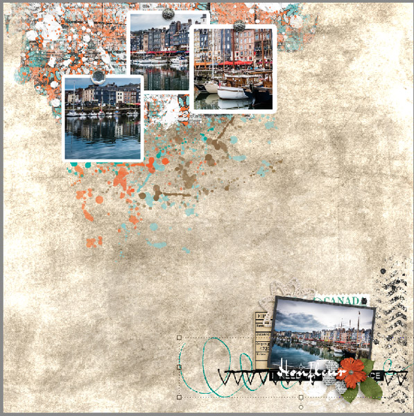
Many of you may feel daunted when you see "Fusion" in my Kit and Collection Packs,
but really, there's nothing to fear. It's my definition of a mish-mash of unrelated embellishments (some vintage, some doodles, some traditional) and different types of papers and backgrounds to give you endless possibilities.
You'll always get your money's worth no matter what style you scrap your pages with because there's always plenty of fun packs to work with!
1. Open up a 12 x 12, 300 dpi, transparent background and drag cbj_so_artsypp11 on top.
2. Next you'll want to drag cbj_so_pageblendits-1 on top of your background.
3. Clip cbj_so_artsypp02.jpg to the page blendit
(Ctrl+alt +G for Windows or command+option+G for Mac)
Here's where we're at:
4. Drag cbj_so_fencebit onto your page and position at the top left like so...
I used the following Drop Shadow settings, but you can feel free to use your favorites:
5. Duplicate the fence bit, rotate it to your liking and place it on the right side of your page
Decrease the Fill to 62%
6. Drag cbj_so_artsybits20 onto your page and place it along the right side.
Decrease the fill to 65%
7. Drag cbj_so_artsybits13 onto your page and place over the left fence bit and duplicate
8. Drag cbj_so_artsybits20 onto your page and flip it vertically. Place it on the left edge.
9. Drag cbj_so_artsybits17 onto your page and position at the top right then duplicate it and position
bottom left.
10. Drag cbj_so_artsybits15 and center on the right edge, duplicate it, flip it horizontally and position on the left edge.
11. Drag cbj_so_artsybits9 onto your page and position at the bottom left then duplicate it, flip it vertically and position at the top right
12. Drag cbj_so_addon_crochlace onto your page ans position to your liking along the right edge
Add the following Drop Shadow settings:
Blend Mode: Multiply
Color: #000000
Opacity 20%
Angel: 45
Distance: 7
Spread: 0
Size: 9
13
13. Drag cbj_so_def_4 (or a definition of your choosing) onto your page and position near the bottom
(for this page I erased the script writing and just used the bold lettering)
Drop the Fill to 52% and add the following Drop Shadow settings:
Blend Mode: Linear Burn
Color: #696258
Opacity 36%
Angel: 45
Distance: 8
Spread: 0
Size: 13
14. Drag cbj_so_burlap onto your page and position at the bottom right corner.
Give it a bit of rotation until you like the result.
Add the following Drop Shadow settings:
Blend Mode: Linear Burn
Color: #696258
Opacity 49%
Angel: 45
Distance: 10
Spread: 0
Size: 13
Duplicate it and position at the top left corner of your page.
15. Drag cbj_so_pageblendits-3 onto your page and clip your photo to it.
Resize to your liking.
Note: the photo I used was from
www.pixabay.com. They have an amazing selection
of stock photos to choose from for FREE! Check it out!
16. Select both the blendit and the photo and while holding the command/crtl key down, left click and drag up so it duplicates.
Lover the Fill on the bottom one to 27% and the copy to 40%.
(you can play with these Fill setting to your liking...these are just the ones that I used)
Erase any bits showing through the photo if you wish.
Here's what we have for our background!
Pretty awesome right? Easy peasy?
Now comes the fun part...embellishing!
Now I'm pretty new at all this clustering and stuff so I'll show you what I did.
(lots of embellishments will be below and above your photo so follow along!
17. Go to your layers panel and click on the cbj_so_burlap layer.
Drag the cbj_so_addon_chevrons onto your page and position down at the bottom towards the left of center.
Drop Shadow settings:
Blend Mode: Multiply
Color: #000000
Opacity 54%
Angel: 45
Distance: 14
Spread: 0
Size: 18
Now drag the cbj_so_addon_beadspill and place on top.
Drop Shadow settings:
Blend Mode: Multiply
Color: #000000
Opacity 40%
Angel: 45
Distance: 14
Spread: 0
Size: 32
Resize both of these to your liking.
18. Duplicate the chevrons (ctrl/command + J) and drag that layer above your burlap copy.
Rotate 90 degrees CCW and position towards the left of the top burlap piece.
19. Drag cbj_so_crochdoily onto your page and position top right.
Drop Shadow settings:
Blend Mode: Multiply
Color: #000000
Opacity 40%
Angel: 120
Distance: 12
Spread: 0
Size: 13
19. Drag cbj_so_addon_bannersh and position at the top right of your page.
Add an extra drop shadow of
Blend Mode: Multiply
Color: #000000
Opacity 40%
Angel: 120
Distance:27
Spread: 0
Size: 21
And here's where we are now...
Drag cbj_so_addon_ribbon1 onto your page and position vertically along the bottom right edge.
Drop Shadow settings:
Blend Mode: Multiply
Color: #000000
Opacity 40%
Angel: 120
Distance: 50
Spread: 0
Size: 50
20. Duplicate your doily and bring it down to the bottom right corner.
21. Duplicate your ribbon, drag that layer above the doily and rotate 90 degrees CCW then flip horizontally.
Your page should look like this
(or close if you've made your own tweaking)
22. Click on your top chevrons copy.
Drag cbj_so_addon_leaf and rotate a little more that 45 degrees clockwise.
Drop Shadow settings:
Blend Mode: Multiply
Color: #000000
Opacity 40%
Angel: 120
Distance: 25
Spread: 0
Size: 32
Duplicate and flip horizontally and move to the left
(you'll adjust in a bit)
Drag cbj_so_doodleflower1 and place over the 2 leaves.
Copy the leaves drop shadow and paste on the flower layer.
Resize and position to your liking.
We're looking good now!
23. Duplicate the doodle flower and drag it down to the bottom right corner over the ribbon.
24. Drag cbj_so_addon_flower4 and position over your top doodle flower
(use the same drop shadow settings as the doodle flower)
25. Drag cbj_so_addon_bow to your page and place over your blue flower.
Drop Shadow settings:
Blend Mode: Multiply
Color: #000000
Opacity 60%
Angel: 120
Distance: 25
Spread: 0
Size: 46
Resize and position to your liking.
Here's where we are now!
(if you notice on your layers panel...this has all been done BELOW your blendits and photo layers)
26. Now click on the top photo you selected
(remember you duplicated them)
Drag cbj_so_crochdoily and position on the center left edge. Copy the shadow settings from one of the previous doilies.
Drag cbj_so_doodleflower1 onto your page and position on top and off right of the doily you just added. Copy and paste the drop shadow settings from the earlier doodle flower.
Drag cbj_so_addon_ribbon1 onto your page and rotate 90 degrees CW
Drop Shadow settings:
Blend Mode: Multiply
Color: #000000
Opacity 60%
Angel: 120
Distance: 28
Spread: 0
Size: 32
Position along the left edge center.
Duplicate the ribbon, rotate it 90 degrees CW and position at the top above the bow.
(see below!)
27. Drag cbj_so_addon_flair onto your page and position on top and just to the right of the left edge ribbon, overlapping it a bit.
Drop Shadow settings:
Blend Mode: Multiply
Color: #000000
Opacity 60%
Angel: 120
Distance: 17
Spread: 0
Size: 50
28. Drag cbj_so_addon_leaf onto your page and place at he left edge, rotated right just a bit so that it overlaps the flair
Drop Shadow settings:
Blend Mode: Multiply
Color: #000000
Opacity 40%
Angel: 120
Distance: 25
Spread: 0
Size: 32
Duplicate the leaf and rotate a bit to the left.
Holding your Shift key, click on the two leaf layers, then command/ctrl and left click to drag the two layers above.
Keeping those two layers highlighted (active), rotate them vertically and move down
(you'll re-position these after we add a few more things.)
And here's what you should have so far is you've been following along!
29. Now drag cbj_so_addon_flower4 and position over the top leaf pair.
Copy and paste the same drop shadow setting of one of the leaves.
Duplicate the flower and position over the bottom leaf pair.
Drag cbj_so_flower3 onto your page and position on top of the 2 blue flowers, slightly off-center and down a bit.
Drop Shadow settings:
Blend Mode: Multiply
Color: #000000
Opacity 40%
Angel: 120
Distance: 50
Spread: 0
Size: 50
30. Duplicate the white flower and position it in the bottom right corner of your page.
31. Drag cbj_so_flower1 onto your page and position slightly above and left of the white flower on the left edge.
Drop Shadow settings:
Blend Mode: Multiply
Color: #000000
Opacity 40%
Angel: 120
Distance: 25
Spread: 0
Size: 32
Duplicate it and bring it down to the bottom right corner.
Your page should now look something like this:
(we're almost done!!!)
32. Duplicate the blue flower (cbj_so_addon_flower4) and position along the bottom right edge.
33. Drag cbj_so_flower4 to your page and position on top and central to the 3 flowers in the bottom corner. Resize to your liking.
Drop Shadow settings:
Blend Mode: Multiply
Color: #000000
Opacity 40%
Angel: 45
Distance: 25
Spread: 0
Size: 32
Duplicate this flower and position on top of the top edge ribbon, then duplicate again and position on top of the pink flower on the left.
(I like to rotate my flowers so they don't all look the same and resize them differently. Of course it's totally up to you what you choose to do with them!)
34. Drag cbj_so_addon_dragonfly onto your page, resize, rotate to your liking and position over your bottom right corner cluster.
Drop Shadow settings:
Blend Mode: Multiply
Color: #000000
Opacity 40%
Angel: 45
Distance: 25
Spread: 0
Size: 32
Duplicate and move the little guy to the left cluster.
35. Drag cbj_so_flower1 onto your page and position on the top cluster.
apply the same shadow as the pink flower on the left
One more thing before tweaking!
I wanted to add one of the outlined word bits to my title so if you do too...select the one you like and drag it to your page, centering it over the title.
I chose cbj_so_wboutlinesDK_31.
Add a 2-3 px white stroke.
Create a new layer above and merge with the wordbit.
Add the following drop shadow:
Blend Mode: Multiply
Color: #000000
Opacity 28%
Angel: 45
Distance: 8
Spread: 0
Size: 8
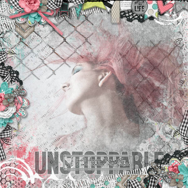
Now just do a little tweaking to your clusters and you're done!
Mt preference is to have my side cluster a bit smaller so I resize accordingly...but that's me!
So if you've followed along step by step...you now have a gorgeous fusion page!
That wasn't so difficult, was it?
If you have any questions please don't hesitate to email me
HERE
I'm always available to answer question!
I hope you enjoyed this tutorial and start creating more fusion pages in the future!